Label Designer
The label designer enables you to view label templates, test label templates against different equipment, and change the design of a label. To open the designer while viewing the Arc Flash Hazard Report, from the Table Report tab, click the arrow below Label and select Label Designer.
The designer has two different modes of operation:
- View mode: The designer when first displayed is in view mode. Use this mode to select which template you want to work with or to see how each template behaves using different devices from the Arc Flash Hazard Report. Label templates cannot be modified in this mode.
- Edit mode: This mode opens when you click Start Edit on the Design Labels tab. When you are in this mode, you can modify the design of the label template you selected. You can exit this mode by saving or discarding your label changes.
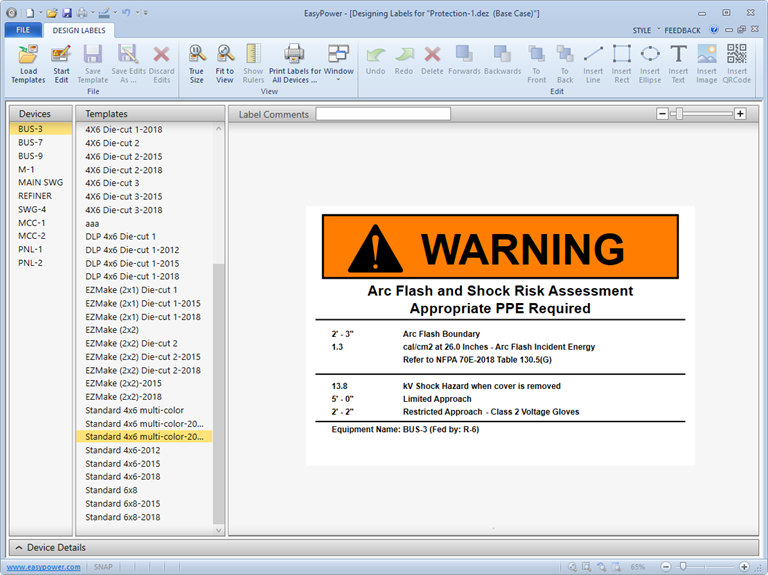
Figure 1: View Mode
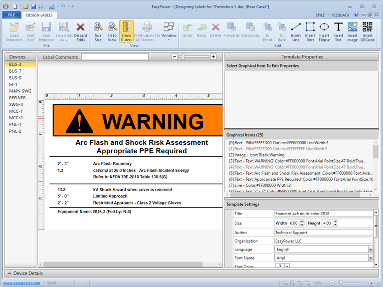
Figure 2: Edit Mode
Design Labels Tab
When the label designer window is active, EasyPower displays the Design Labels tab.
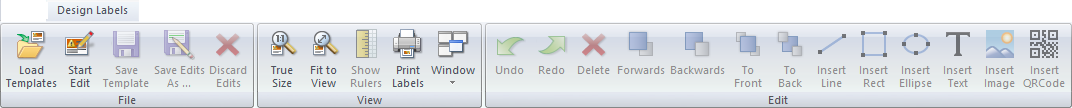
Figure 3: Design Labels Tab
This table describes the available options.
|
Option |
Description |
|---|---|
|
Load Templates |
Opens a different folder of label templates and changes the location of templates used by EasyPower. |
|
Start Edit |
Start editing a template. |
|
Save Template |
Saves edits you have made to the current template. This overwrites the existing template file. |
|
Save Edits As |
Saves the template to a new file instead of overwriting the existing one. Files will be saved with the .AFL extension. |
|
Discard Edits |
Discards all the edits you performed during the edit session. |
|
True Size |
Displays the label preview in the exact size in which it is being designed. |
|
Fit to View |
Maximizes the label to fit onto the size of the display window. Because you can resize the label print window, this function renders the drawing to best fit into the resized window. |
|
Show Rulers |
Shows the ruler dimensions of the design label. |
|
Window |
Displays the list of opened windows—some of which are hidden behind another window. Selecting any window in this list will activate and bring up that window to the front. |
|
Undo |
This option will undo an edit each time you click. You can undo several edits by clicking multiple times. |
|
Redo |
This option will redo an edit each time you click. You can redo several edits by clicking multiple times. |
|
Delete |
Deletes the selected graphical item. |
|
Forwards |
Brings the selected item one layer forward. |
|
Backwards |
Sends the selected item one layer backward. |
|
To Front |
Brings the selected item all the way to the front. |
|
To Back |
Sends the selected item to the furthest background layer. |
|
Insert Line |
Inserts a line graphical item. |
|
Insert Rect |
Inserts a rectangle graphical item. |
|
Insert Ellipse |
Inserts an ellipse graphical item. |
|
Insert Text |
Inserts a text graphical item (potentially containing variables from the Arc Flash Hazard Report). |
|
Insert Image |
Inserts an image graphical item. |
|
Insert QRCode |
Inserts a QR Code graphical item. |
Label Template List
The Templates list near the center of the window shows all the label templates in the arc flash label templates folder. This panel is only available in the label designer’s View mode.
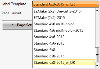
Figure 4: Label Template List
The label preview uses the currently selected template and is updated as the selected template is changed. This provides a quick way to find the desired template.
To list the templates that are available in a different folder, click Load Templates on the Design Labels tab.
Devices List
The Devices list at the left of the window shows all the devices listed in the Arc Flash Hazard Report when the label designer was started.
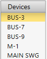
Figure 5: Devices List
This list of devices can be used when editing a label to ensure that the label will print as you expect it to for a variety of different labels. Select a different device to preview your label design under different device scenarios.
The label preview uses the currently selected device, and the selected device can change at any time in the label designer to view the edited label under different conditions.
Template Properties Pane
The Template Properties pane is displayed when editing a label and provides control over all aspects of your label design. It contains three sub-panes as shown here.
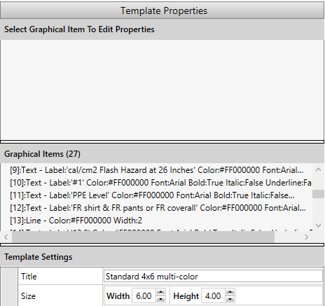
Figure 6: Template Properties
Item Properties: This pane shows the properties of the selected item. Click one of the graphical items on the template preview to see its properties.
Graphical Items: This list shows all graphical items on the label template. The currently selected graphical item is highlighted in the list. This list can also be used to select a specific item on the template if it cannot easily be clicked on.
Template Settings: This pane enables you to view and modify settings that apply to the entire label template. The table below describes the options.
| Option | Description |
|---|---|
|
Title |
Title of the template. |
|
Size |
Dimensions of label for which this template is designed. |
|
Author |
Author of the template. |
|
Organization |
Organization/Company who designed template. |
|
Language |
Language settings of the entire template. French, Spanish and English are supported. Currently this only effects which month names are used. |
|
Font Name |
Default font to use for template. |
|
Font Color |
Default color for text. |
|
Font Point Size |
Default point size for text. |
|
Font - Bold/Italic/Underline |
Default style for text. |
|
Modification Date |
Date the template was last saved. |
|
Template File |
File name of the template. |
Text Properties
When you select a text item in the label graphic or in the Graphical Items list, the Text Item area displays properties for the selected text item. Text items can consist of static text, variables from the Arc Flash Hazard Report, or a combination of both. The text that is displayed can also vary based on different conditions. The Text Item properties provides you with control over all of these aspects of the displayed text.
| Option | Description |
|---|---|
|
Text |
Contents of the text item (text and variables). Text content can also be conditional based on the arc flash variable. |
|
Position |
Position (and optionally size) for the text item. Horizontal and vertical alignment are also taken into account. |
|
HAlignment (Horizontal) |
Controls whether the text appears to the left, centered or right of the specified text position. |
|
Point Size |
Point size of the text (this overrides the template default). |
|
Font |
Font to use for the text (this overrides the template default). |
|
Color |
Color to use for the text (this overrides the template default). Color can also be conditional based on the arc flash variable. |
|
Bold |
Whether the text is bold (this overrides the template default). |
|
Italic |
Whether the text is italic (this overrides the template default). |
|
Underline |
Whether the text is underlined (this overrides the template default). |
|
Visibility |
Controls when this text is visible using a visibility condition based on the arc flash variable. |
|
VAlignment (Vertical) |
Controls whether text appears at the top, bottom or baseline relative to the text position. |
Line Properties
When you select a line item in the label graphic or in the Graphical Items list, the Line Item area displays properties for the selected line item.
| Option | Description |
|---|---|
|
Line |
Coordinates for the start and end of the line. |
|
Color |
Color of the line. Color can also be conditional based on the arc flash variable. |
|
Width |
Thickness of the line. |
|
Visibility |
Controls when this text is visible using a visibility condition based on the arc flash variable. |
Rectangle Properties
When you select a rectangle item in the label graphic or in the Graphical Items list, the Rectangle Item area displays properties for the selected rectangle item.
| Option | Description |
|---|---|
|
Rect |
Specify the position and size of the rectangle. |
|
Fill |
Color of the rectangle. Color can also be conditional based on the arc flash variable. |
|
Outline |
Color of the rectangle outline. Color can also be conditional based on the arc flash variable. |
|
Outline Width |
Width of rectangle outline. |
|
Visibility |
Controls when this rectangle is visible using a visibility condition based on the arc flash variable. |
Ellipse Properties
When you select an Ellipse item in the label graphic or in the Graphical Items list, the Ellipse Item area displays properties for the selected ellipse item.
| Option | Description |
|---|---|
|
Ellipse |
Specify the position and size of the ellipse. |
|
Fill |
Color of the ellipse. Color can also be conditional based on the arc flash variable. |
|
Outline |
Color of the ellipse outline. Color can also be conditional based on the arc flash variable. |
|
Outline Width |
Width of ellipse outline. |
|
Visibility |
Controls when this ellipse is visible using a visibility condition based on the arc flash variable. |
Image Properties
When you select an Image item in the label graphic or in the Graphical Items list, the Image Item area displays properties for the selected image item.
| Option | Description |
|---|---|
|
Image |
What image to display. Select from one of the built-in icons or browse for a specific file. |
|
Position |
Size and location of image. |
|
Visibility |
Controls when this image is visible using a visibility condition based on the arc flash variable. |
QRCode Properties
When you select a QR Code item in the label graphic or in the Graphical Items list, the QRCode Item area displays properties for the selected QR Code item. QR Code is an international standard to encode text as black-and-white images suitable for scanning with a digital camera. For more information, see: http://en.wikipedia.org/wiki/QR_code.
| Option | Description |
|---|---|
|
Text |
Text content to be encoded into QR Code (text and variables). Text content can also be conditional based on the arc flash variable. The text itself is not displayed on the label. Only the QR Code image is displayed. |
|
Position |
Location and size of the QR code. Note that the exact size of the QR code image will vary based upon text, mode and version. If the QR code image is smaller, it will be centered inside of the position. |
|
Mode |
Specify the type of text being encoded. The default option of Alphanumeric handles most conditions. Use Byte if you want to encode all ASCII characters. Use Kanji if you want to encode Japanese text. |
|
Error Correction |
Specify the level of error correction in the QR code image. Based on the size of the code on the label, different levels of error correction can enhance the ability to scan the QR code. |
|
Visibility |
Control when this QR code is visible using a visibility condition based on the arc flash variable. |
Device Details Pane
The Device Details pane is collapsed by default at the bottom of the label designer window and can be displayed by clicking on the Device Details pane heading. When visible, this panel shows all the devices from the Arc Flash Hazard Report and the raw values that are available from the report. From this pane, you can perform the following actions:
- Selecting a device in the list changes which device is selected for preview.
- Clicking on the caret “^” or “v” next to the Device Details pane name enables you to collapse or expand the row details.
- Clicking on the column headers (for example, Device Name and Arc Fault Bus) enables you to sort the row sequence in ascending or descending order.
- Clicking on the funnel-shaped icon next to each column enables you to specify filters to sort.
- Scrolling through each row displays device information.
- Holding the left-mouse button and then dragging a column heading to another position repositions the column.
More Information
| Arc Flash Hazard Analysis | Controlling when Text is Visible |
| Arc Flash Hazard Labels | Creating a Custom Label Template |
| Changing Text on a Label Template | Label Variables |
|